

Feedback buttons are a Creatives feature, part of the Formbricks Enterprise
Edition on self-hosted instances. Using Formbricks Cloud? Build your own
button as described in the Feedback Box guide.
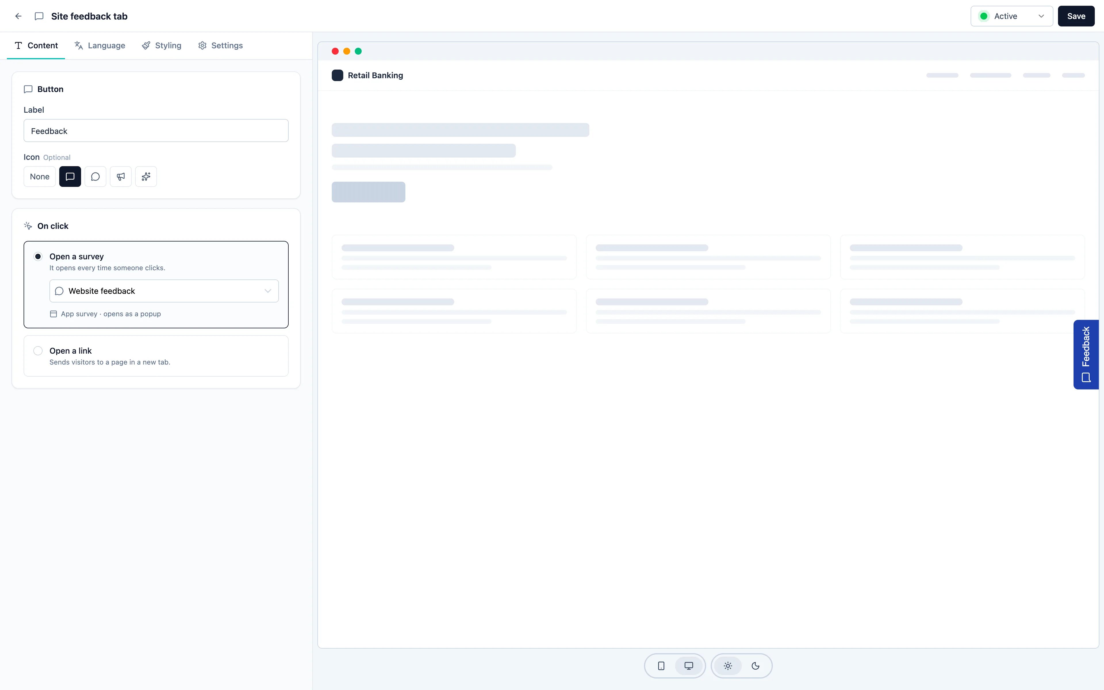
Content
On the Content tab:- Label: the text on the button, “Feedback” by default.
- Icon (optional): Message (the default), Chat bubble, Megaphone, Sparkles or None.
- On click: what the button opens. A feedback button always needs one before you can publish it.
On click
- Open a survey: pick an app or link survey from the workspace. The line under the picker tells you how it opens:
- App survey · opens as a popup: the survey opens on the page, right away, on every click, even if the visitor already answered it. Its own delay, auto-close, targeting and recontact settings don’t apply to clicks.
- Link survey · opens in a new tab: if your site sets a language with
setLanguage, the survey opens in that language.
- Open a link: sends visitors to a full
https://orhttp://address in a new tab, for example your support center.
Styling
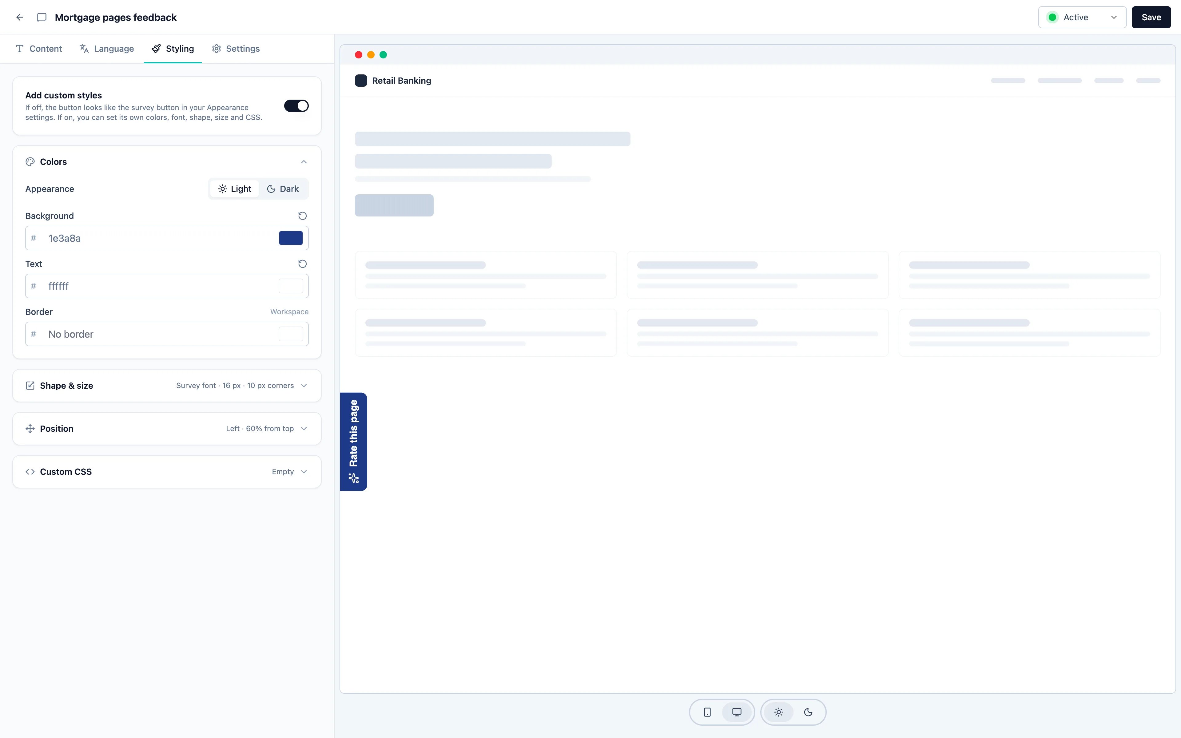
By default, the button looks like the survey button in your workspace Look & Feel: same colors, font, size and corners. Change those settings and your feedback buttons follow. Turn on Add custom styles to give the button its own look:
If the text on the background drops below a 4.5 : 1 contrast ratio, in light or in dark mode, the editor warns you so the label stays readable for everyone.
Font size and padding can be different on phones: switch the card to Phone and change them. Phone values apply below 768 px wide; a phone field you leave as it is uses the desktop value.
Position
Position applies whether or not custom styles are on:- Edge: Left, Right (the default) or Bottom.
- Offset: where the button’s center sits along that edge, in percent: from the top for the left and right edges, from the left for the bottom edge. The default is 50 %, the middle.
Dark mode
A feedback button shows its dark colors when your site asks for dark mode through the SDK, withformbricks.setAppearance("dark"), or with "system" to follow the visitor’s device. Without it, buttons show their light colors. See Dark Mode.
Custom CSS
Custom CSS applies to this button only, and only while Add custom styles is on. The button’s element is.fb-creative-button. Base CSS applies in light and dark mode; switch the card to Dark for Dark CSS, which adds rules for dark mode only. Your workspace Custom CSS doesn’t apply to creatives.
@import, @font-face, url() and similar are removed when you save, and the editor tells you. It can hold up to 20 KB.
On your website
- The button is a real button in the page’s tab order, with a visible focus ring. It never takes the visitor’s focus by itself and doesn’t animate.
- It is drawn in its own isolated layer (a Shadow DOM), so your page’s CSS doesn’t change it and its styles don’t leak into your page. With Page font, it uses your page’s font.
- It moves aside so Overlay banners don’t cover it. An open survey always sits on top of it.
- It stays on the page after a click and after a response.
- If your site uses a Content Security Policy with nonces, pass the nonce with
formbricks.setNonce(), or the button’s styles are blocked.
Still have questions? Join us in GitHub Discussions and we’ll be glad to help.