

Responses and Feedback Records
A survey response is one submission of one survey. It lives with that survey, keeps the exact shape of the questions you asked, and is the right thing to read when you want to see what a single person said. A Feedback Record is one answer to one question, rewritten into a shape that is the same for every source. Each record carries when it was collected, which source it came from, what kind of question it was (nps, csat, rating, text, …) and the answer itself. One response becomes several records - one per
answered question.
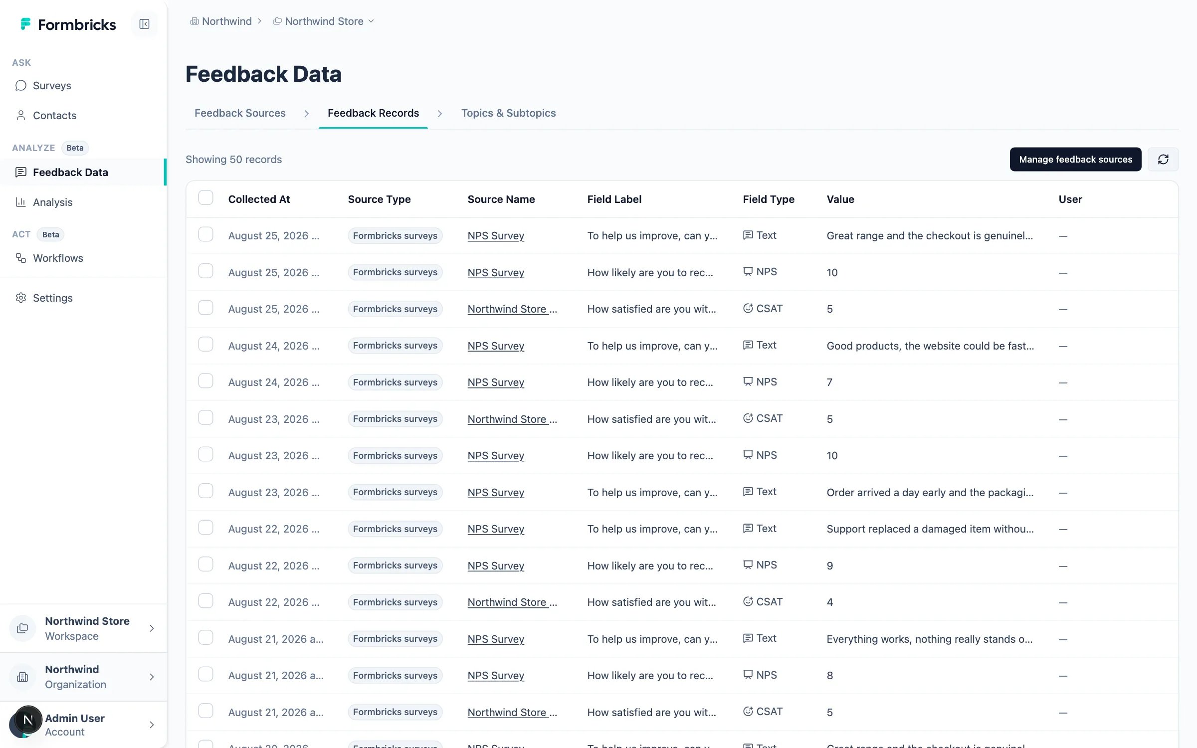
- One shape across sources. NPS from a survey, a CSV upload, or the API all become
npsrecords, so a single chart can cover all of them. - Measures that know what a score means. Because the record is typed, Formbricks can offer
NPS: Score,CSAT: ScoreorNPS: Detractorsas ready-made measures instead of asking you to build the math yourself. - Comparisons across surveys. Two surveys pointed at the same dataset can sit on the same chart and the same time axis.
- Enrichment. Open text is scored for sentiment and emotion as it arrives, which gives you dimensions you never asked a question about.
What you need before your first chart
Three things have to exist, in this order. Skipping the first is the most common reason Analysis looks broken: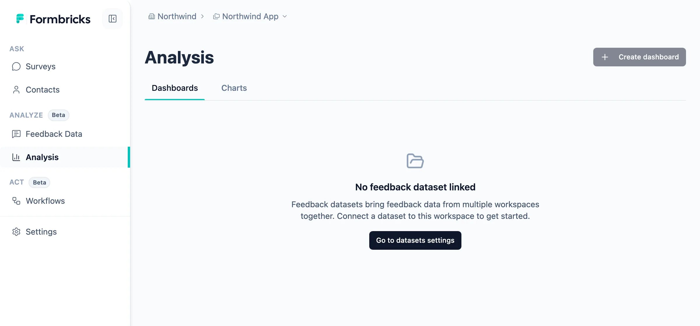
1
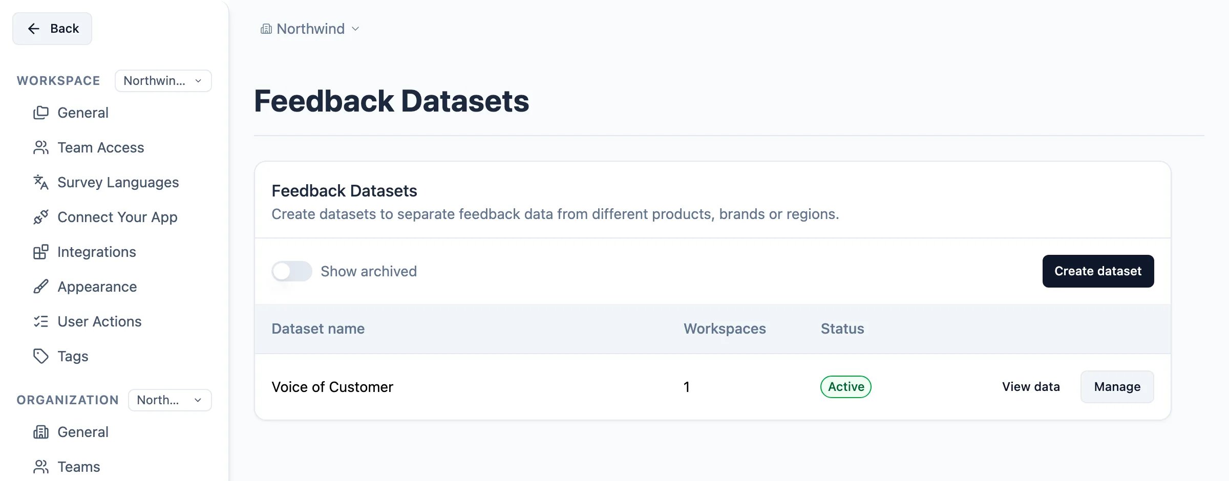
Create a Feedback Dataset and link it to your workspace
Datasets live at the organization level. Go to Settings → Organization → Datasets and click
Create dataset. Give it a name that describes the body of feedback rather than a single survey - most teams
start with one dataset such as “Voice of Customer”.Under Workspace access, pick the workspaces that should be able to read it. A workspace can only be linked
to one dataset, so this choice decides where that workspace’s charts get their data.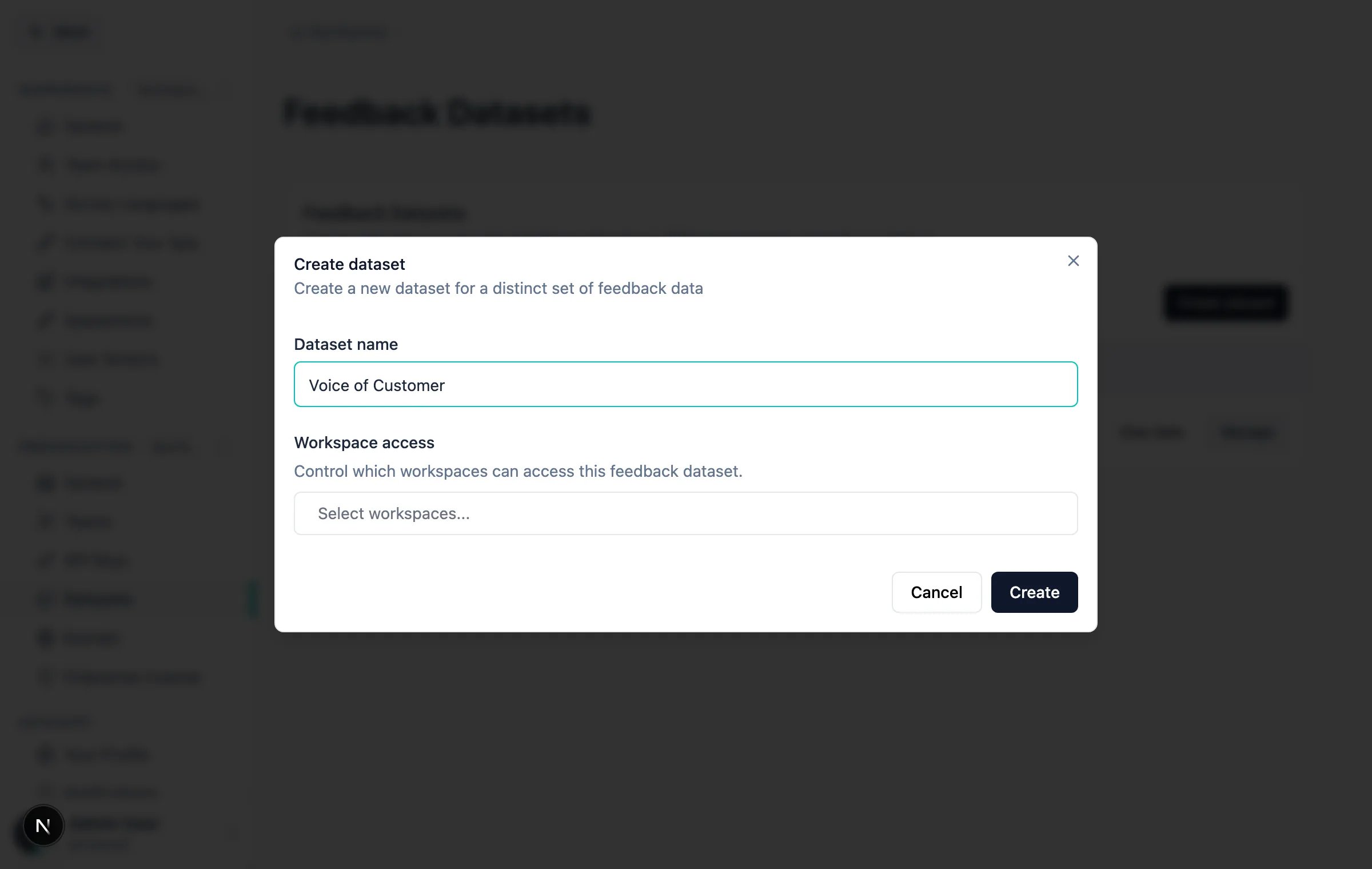
2
Connect a Feedback Source
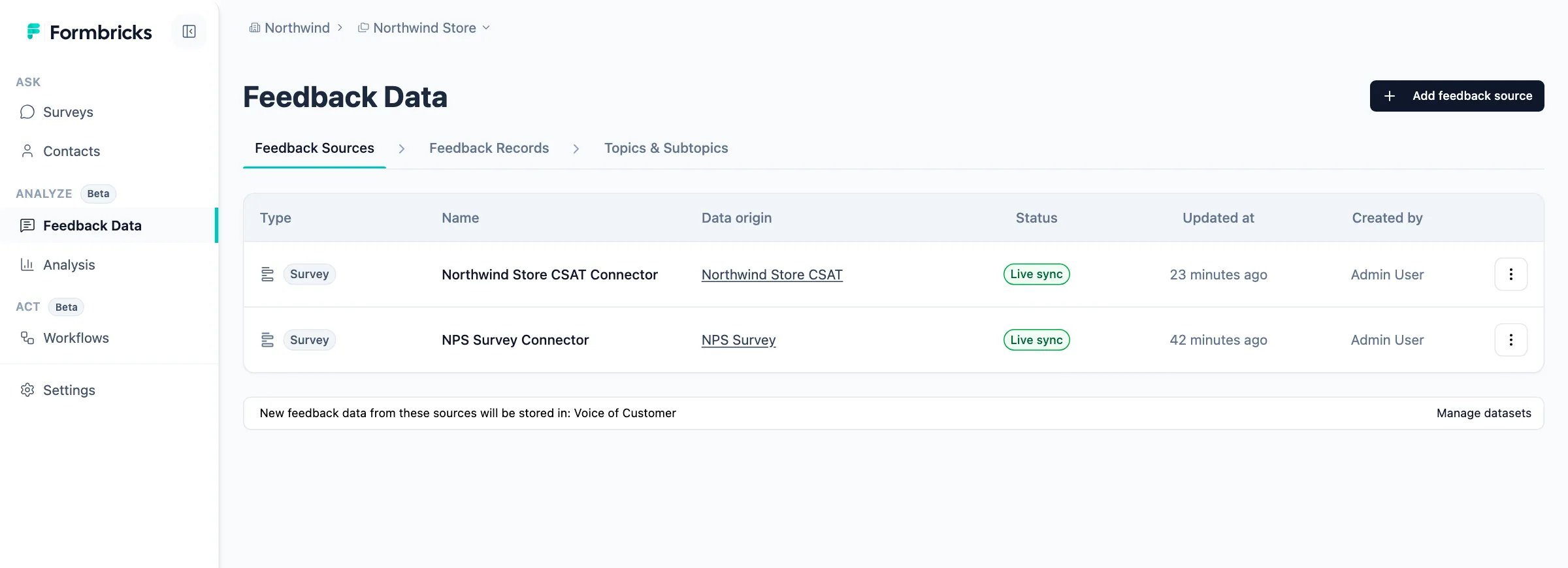
A source is what turns incoming data into records. Go to Analyze → Feedback Data → Feedback Sources and click
Add feedback source.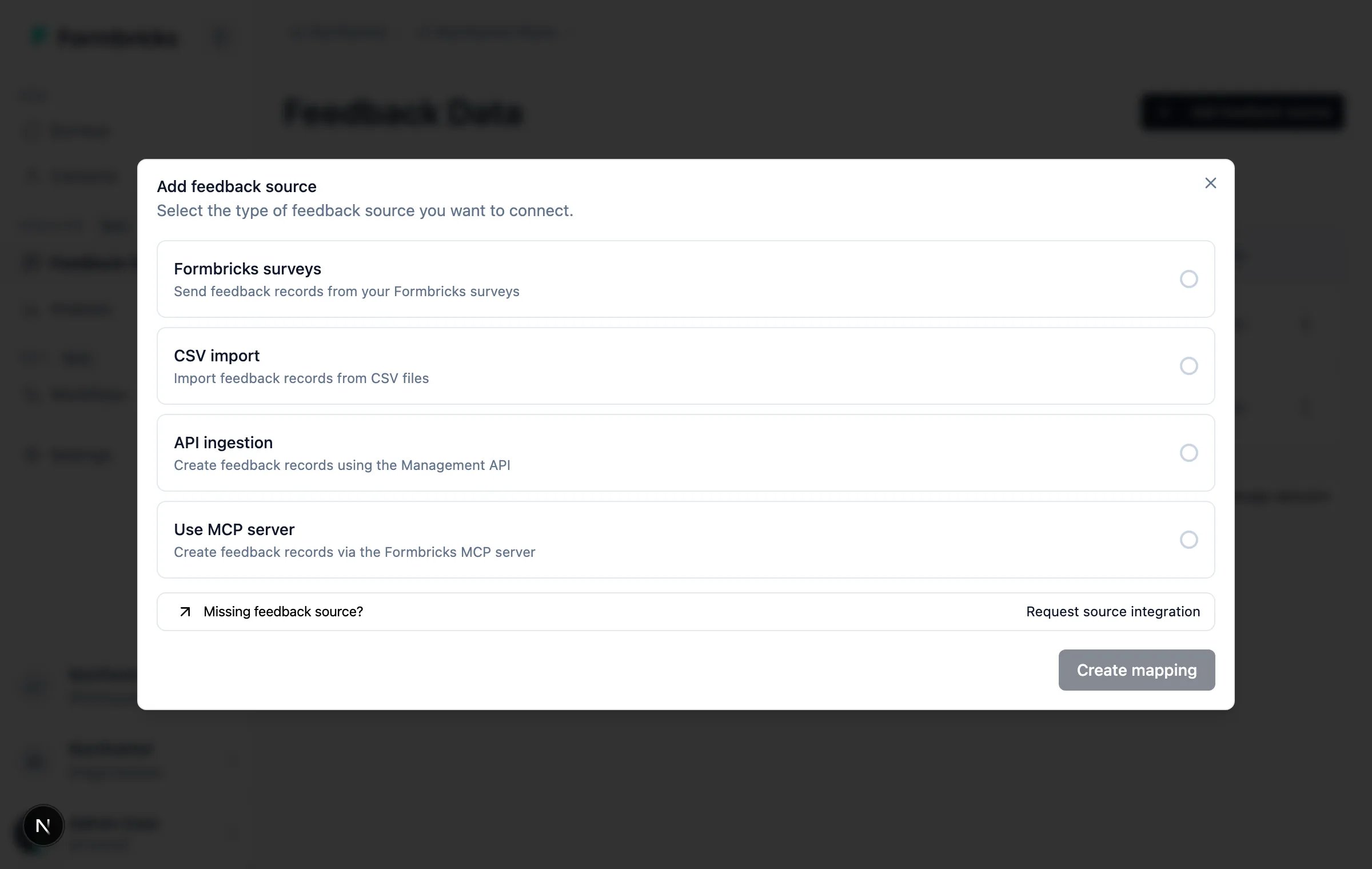
nps record without
any mapping work.Leave Import historical responses on to backfill the responses you already collected. With it off, only
responses submitted from now on become records.3
Build charts and group them on a dashboard
Charts live under Analyze → Analysis. Every chart is scoped to the dataset your workspace is linked to.
Use case 1: An NPS program you can read at a glance
The most common starting point. Create a survey from the NPS Survey template (Surveys → New Survey, search for “NPS”), publish it, collect some responses, and connect it as a source using the steps above. Now open Analyze → Analysis → Charts and click Create chart. You can describe the chart in natural language or build it by hand; the three charts below are built by hand so you can see exactly which controls do what.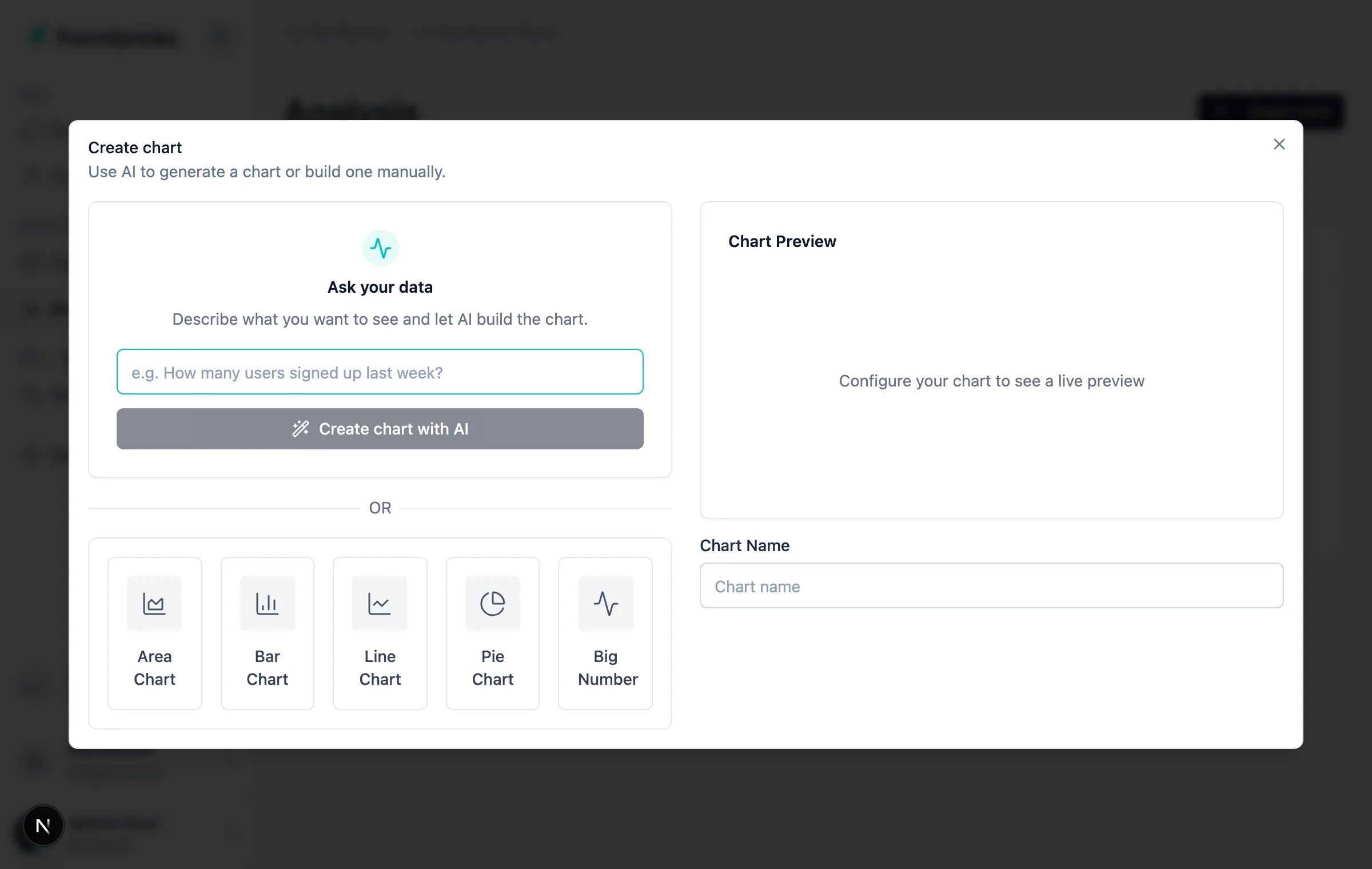
The AI builder needs Smart functionality (AI) enabled for your organization and a configured AI provider. See
AI Features.
Chart 1: Overall NPS
Your headline number. One value, no dimensions.- Chart type: Big Number
- Measure:
NPS: Score
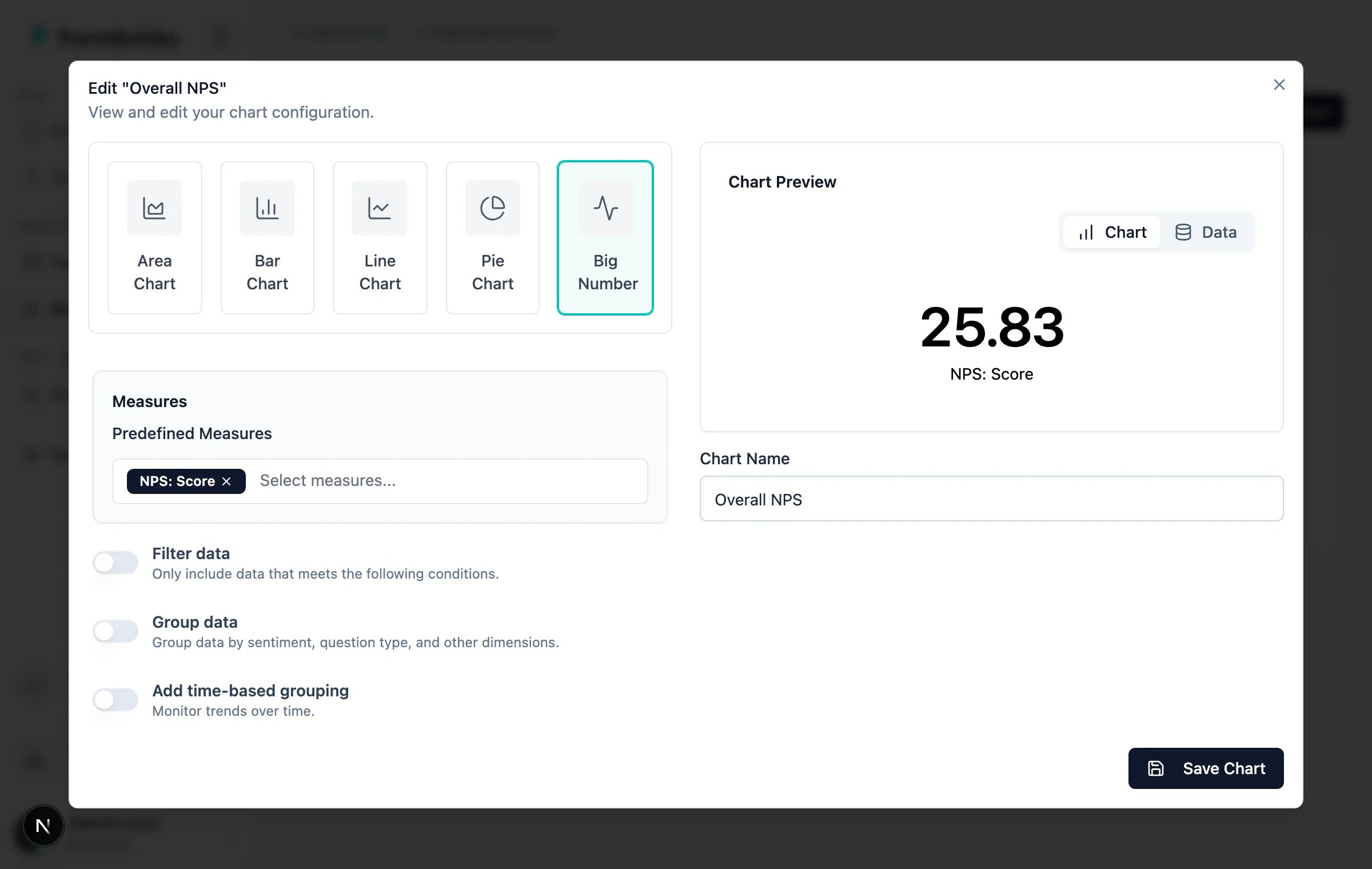
NPS: Score is the standard calculation - ((promoters − detractors) / NPS responses) × 100 - so the number is
comparable to whatever your team quotes today.
Chart 2: NPS over time
A single score tells you where you are. The trend tells you whether what you did last quarter worked.- Chart type: Line Chart
- Measure:
NPS: Score - Add time-based grouping: on
- Field: Collected At
- Granularity: Month
- Date Range: This year
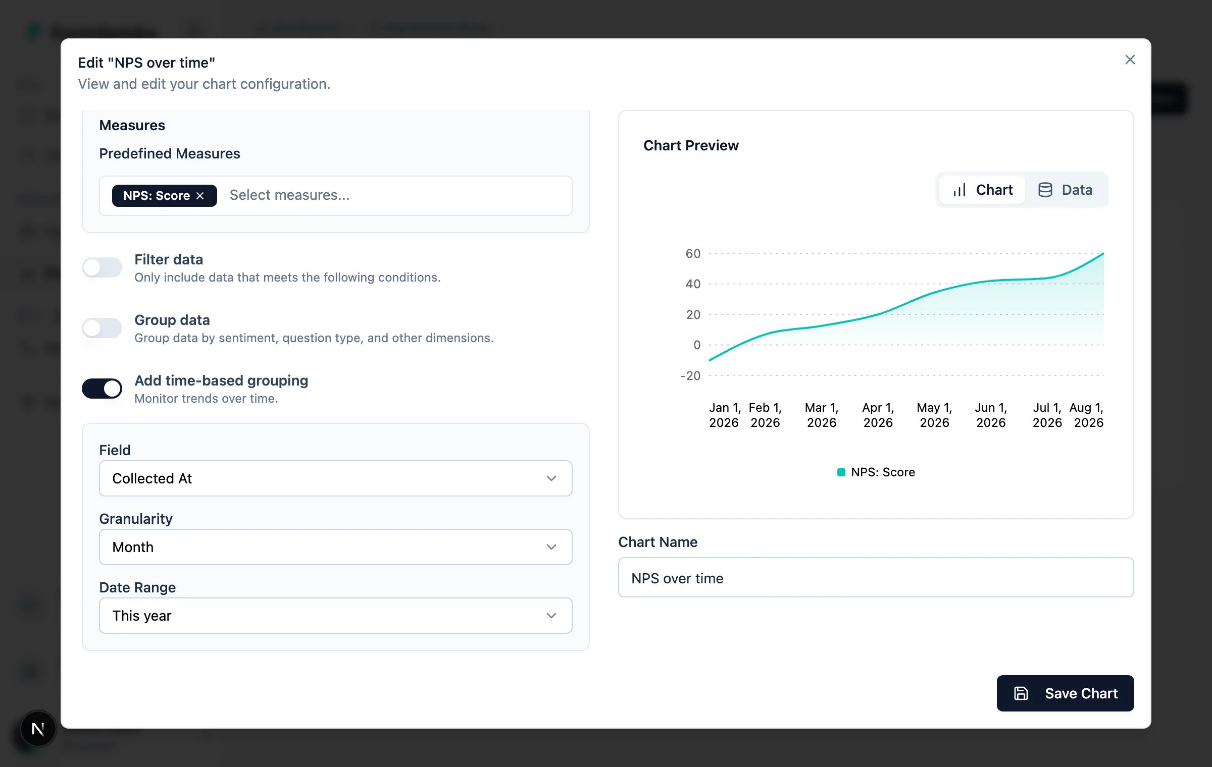
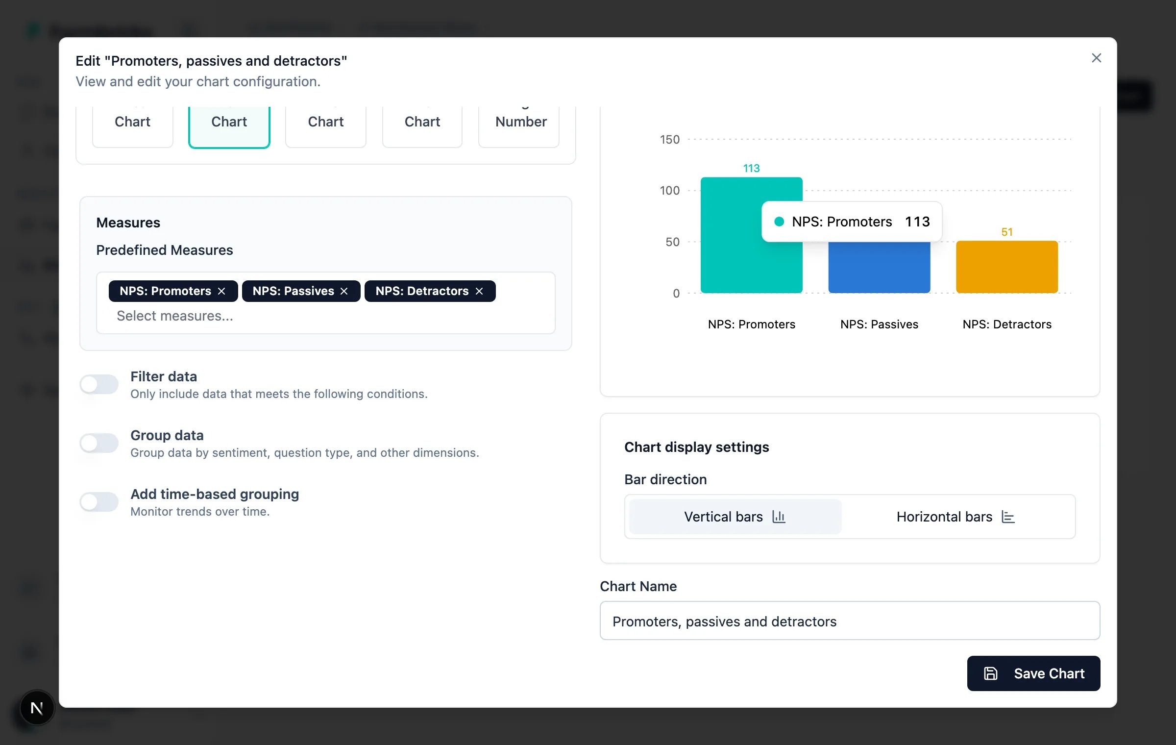
Chart 3: Promoters, passives and detractors
The score hides the shape of your base. A ten-point NPS made of loud promoters and loud detractors is a different business problem from one made of shrugs.- Chart type: Bar Chart
- Measures:
NPS: Promoters,NPS: Passives,NPS: Detractors
Put them on a dashboard
Go to Analyze → Analysis → Dashboards, click Create dashboard, then Add charts and pick the three charts you just built. Drag and resize the widgets into the layout you want; a dashboard-level Date range filter sits above the grid.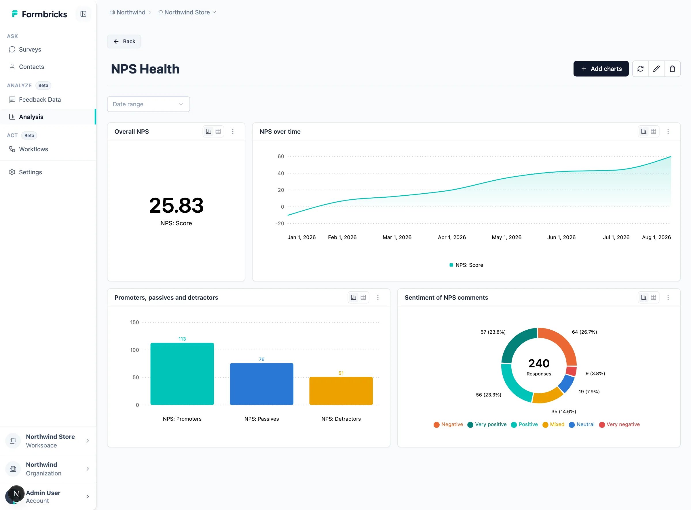
Use case 2: Why the score moved
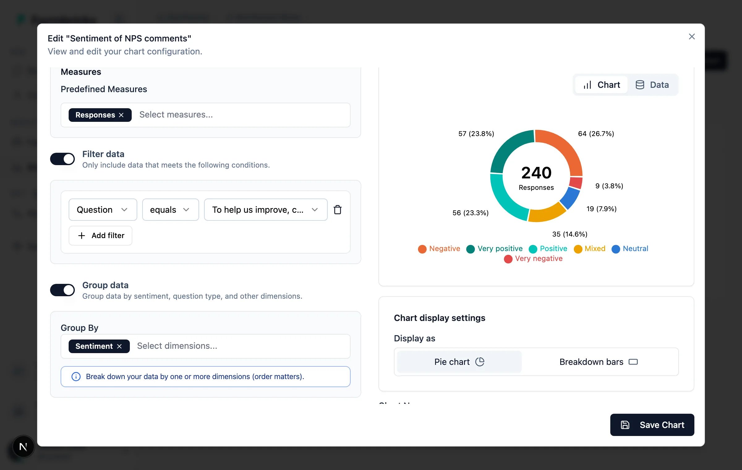
The NPS template asks a follow-up question - “can you describe the reason(s) for your rating?” - and those answers land astext records. Enrichment scores each one for sentiment as it arrives, so you can chart the reasons
without reading them all.
- Chart type: Pie Chart
- Measure:
Responses - Filter data:
Questionequals your follow-up question - Group data → Group By:
Sentiment
Use case 3: One dashboard across surveys
This is where records earn their keep. Add a second survey - a CSAT survey after checkout or a support interaction - and connect it as a second source into the same dataset. Both surveys now produce records on the same time axis, so they can share a chart.- Chart type: Line Chart
- Measures:
NPS: Score,CSAT: Score - Add time-based grouping: Collected At, Month, This year
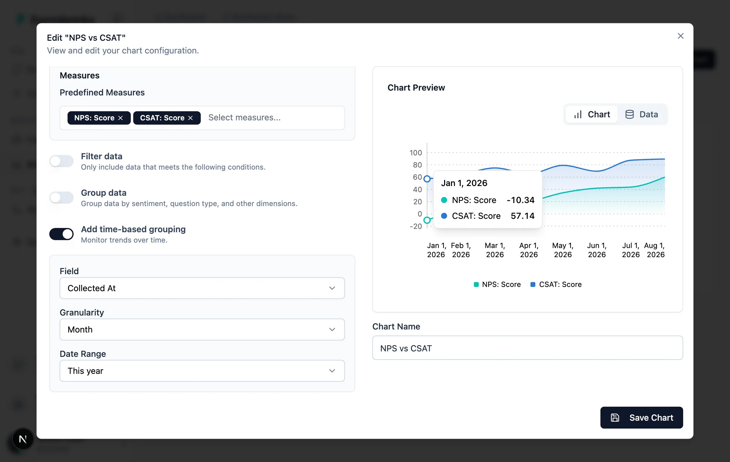
NPS: Score runs from −100 to 100 and
CSAT: Score is the share of responses rated 4 or 5 on the 1-5 scale. When relationship-level NPS and
transactional CSAT diverge, that gap is usually the interesting part.
When a chart looks empty
Analysis says 'No feedback dataset linked'
Analysis says 'No feedback dataset linked'
The workspace has no dataset. Create one under Settings → Organization → Datasets and add this workspace under
Workspace access.
The dataset exists but there are no records
The dataset exists but there are no records
No source is writing into it yet, or the source was created with Import historical responses switched off.
Check Analyze → Feedback Data → Feedback Sources, and confirm the banner under the table names the dataset you
expect.
The chart shows one point, or nothing at all
The chart shows one point, or nothing at all
Widen the Date Range. It defaults to Last 30 days, and a trend chart at Month granularity over 30 days
has almost nothing to draw.
A grouped chart has a large 'Not enriched' slice
A grouped chart has a large 'Not enriched' slice
You are counting records that carry no value for that dimension - usually numeric records in a chart grouped by
sentiment. Add a Filter data condition on
Question or field type to narrow the chart to the records the
dimension applies to.Next steps
Dashboards & Charts
Chart types, the AI builder, and dashboard permissions.
Feedback Sources
CSV uploads, API ingestion, and field mapping.
Enrichment
Sentiment, emotions, and language consolidation.
Topics & Subtopics
Cluster open text into themes.